Spider-Man: No Way Home Rejected These 10 Wild Designs for Lizard (Photos)
Lizard almost looks a lot different in Spider-Man: No Way Home...Over the last few weeks, images from the Spider-Man: No Way Home - The Art of the Movie book made their way online. This provided fans with many tantalizing glimpses of what could have been for the project.
This includes some insane alternative looks for Electro, a much scruffier version of Doc Ock, a scrapped Symbiote suit, and a handful of iconic classic-inspired Spidey costumes.
Some illustrations even revealed that Green Goblin almost had Iron Man armor.
It turns out that among those scrapped ideas were several comic-accurate Lizard designs.
10 Wild Rejected Lizard Designs for No Way HomeSpider-Man: No Way Home - The Art of the Movie book recently released worldwide, and in it were ten rejected designs for the Lizard.
Before going over what could have been, here’s the design audiences got in the final movie. It"s nearly identical to his original appearance in The Amazing Spider-Man, including his infamous flat nose.
 MarvelThese alternate designs, all sadly rejected, noted the flat nostril and instead embraced his full snout.
The result is a monstrous and much more accurate modern take on the character. In this first image, Lizard’s face is far more akin to a T-Rex.
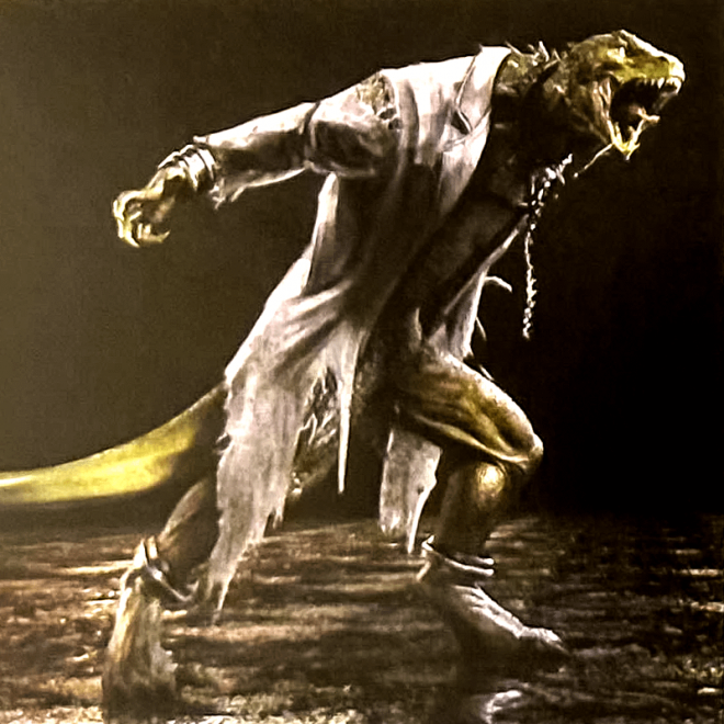
 MarvelThe artists also explored giving the character a broader and human-like stance while wearing a lab coat.
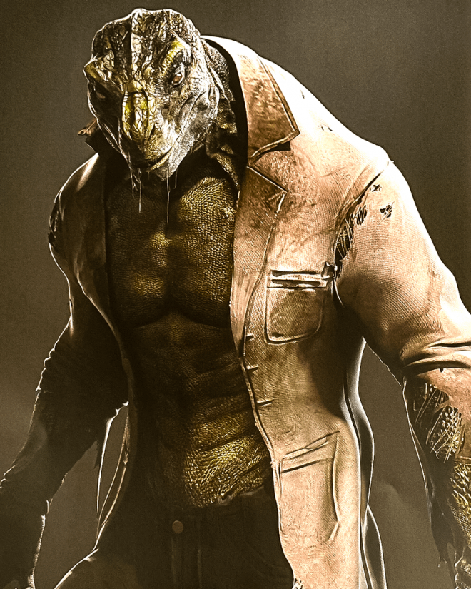 MarvelThis design reigned in the elongated snout, widened his terrifying mouth, and gave him bright yellow eyes.
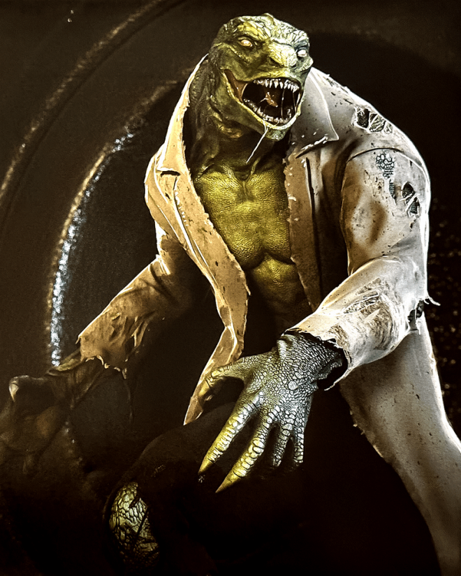 MarvelHere, Lizard’s face gets the fan-favorite snout, though this version tries to distance itself from a Tyrannosaurus Rex.
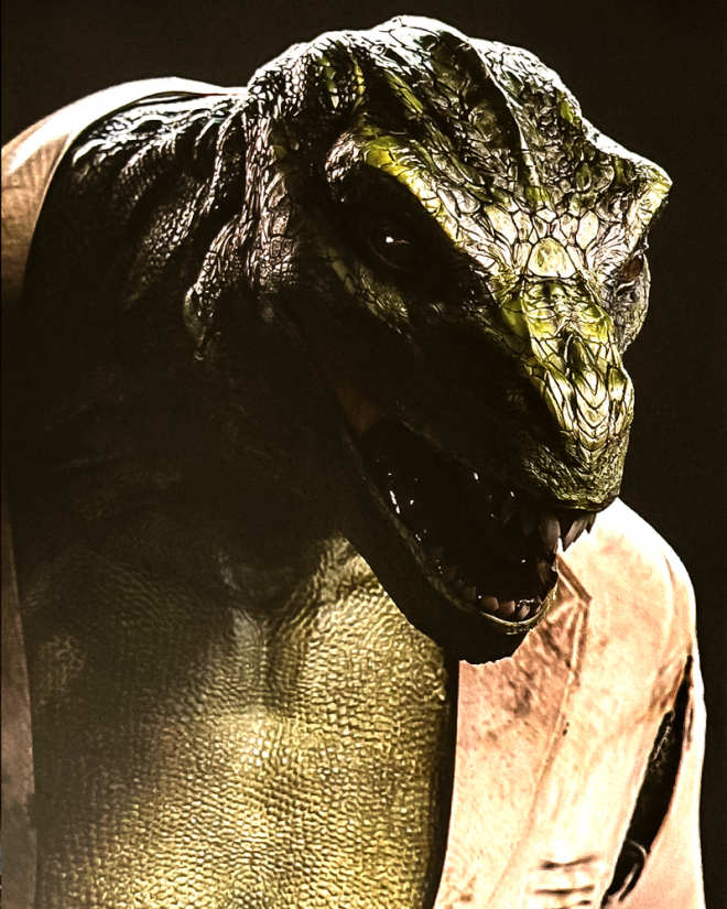 MarvelInstead of giving Lizard bulk, this concept reimagined him with a tall, lanky, and creepy body.
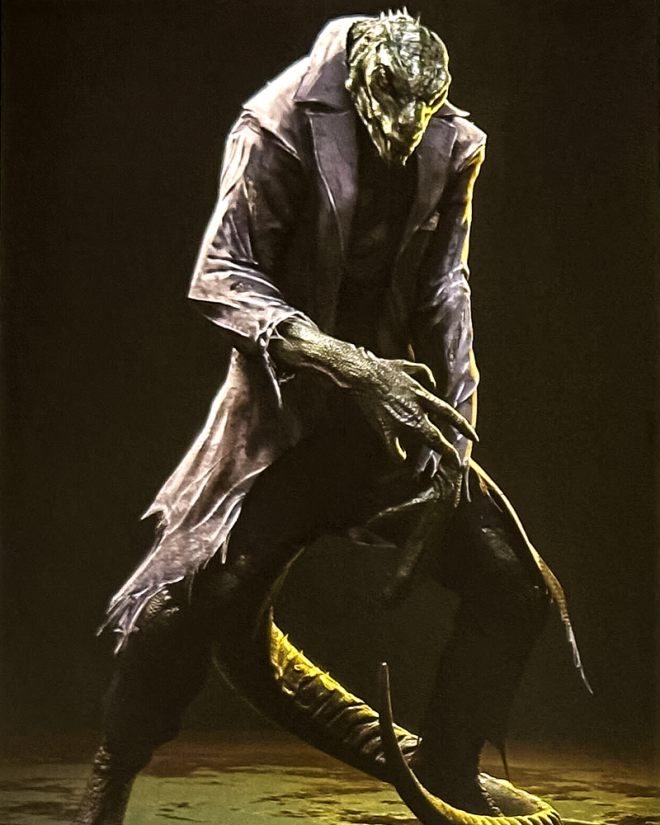 MarvelWhile many of those illustrations feature Curt Connors’ villainous alter ego in a white lab coat, here he’s also donning his iconic purple pants.
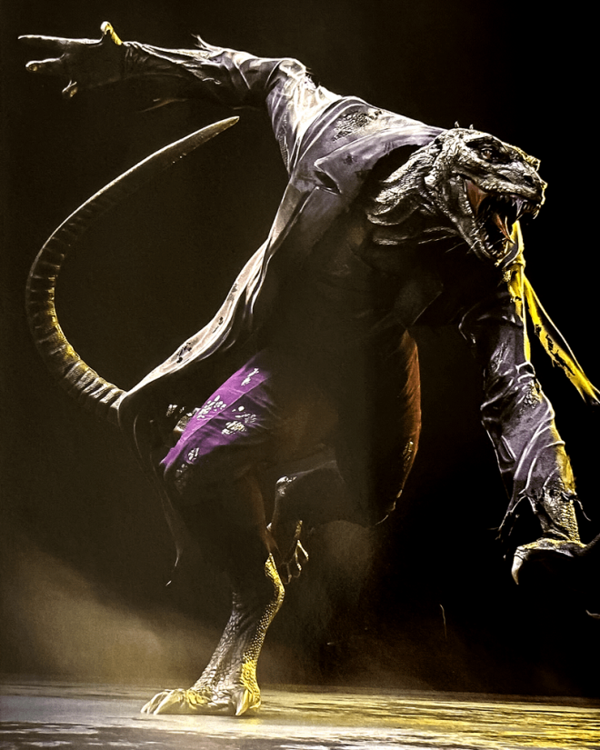 MarvelAnother iteration leaned into the science experiment gone wrong angle of the baddie.
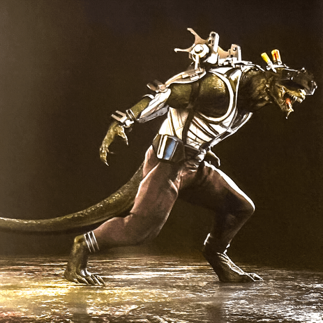 MarvelIt’s unclear what the contraption on his face would have been for—maybe Connors was a big VR fan?
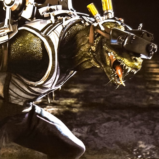 MarvelTaking that experiment angle, this concept art morphed into almost a full sci-fi design.
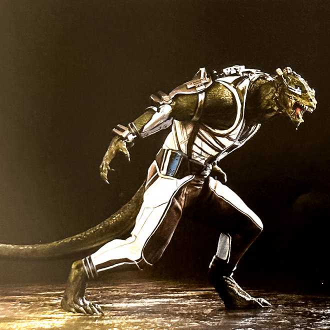 MarvelThis time, his headpiece seems to offer some utility instead of simply hindering him like the ones before.
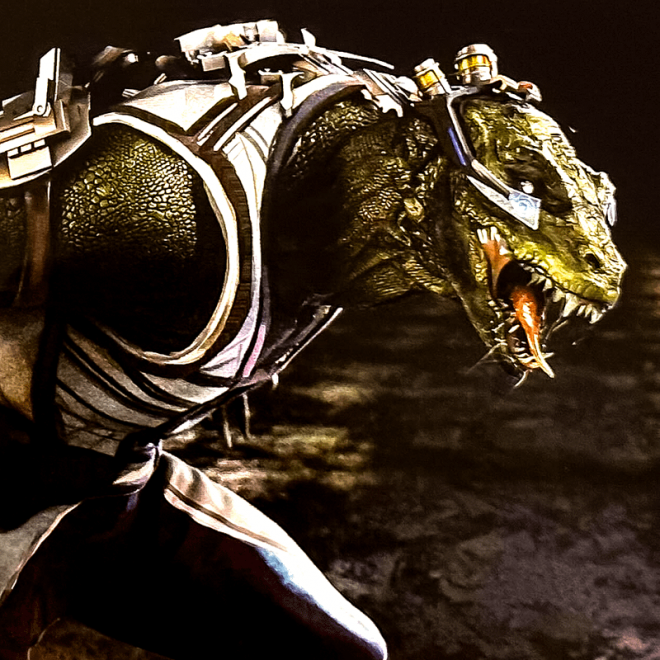 MarvelIf fans wondered what Lizard might look like if he had to fight to the death in a gladiator arena, this might be pretty close.
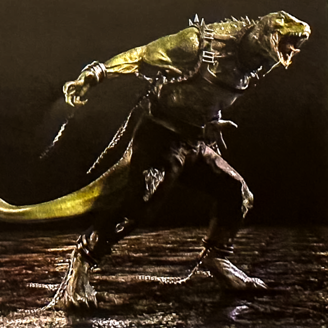 MarvelDitching the punk gladiator style, this final design put the lab coat back on and kept broken shackles on Curt—suggesting he just escaped from incarceration somewhere.
 MarvelFans Were So Close to a Comic-Accurate LizardMuch like the radical alternate designs of Spider-Man: No Way Home’s other villains, it makes sense why those changes were ditched. If the visuals behind each of them were too different, they would no longer feel like their original incarnations.
While that’s a valid stance for the movie to take, fans were still so close to a classic Lizard, lab coat and all—that stings. While Lizard isn’t likely to be adapted again on screen anytime soon, one can’t help but hope that when he is, it’ll be something akin to these rejected designs.
If any of the returning supervillains were to get a redesign, one would have thought Lizard might be first up. After all, his original design is hated by many, with people particularly taking issue with his flatter face.
It’s a shame that fans got so little of him in No Way Home as it is. He was basically just an additional body for the fight scenes and got nothing of substance, just like Sandman.
At least the movie is plenty good to make up for it.
No Way Home is now available to buy digitally.
[圖擷取自網路,如有疑問請私訊]
|
本篇 |
不想錯過? 請追蹤FB專頁! |
| 喜歡這篇嗎?快分享吧! |
相關文章
SuperHeroKing


